Join us for an in-depth conversation with Robin Grenville Evans, the creator of the Venna’s Planet graphic novel series. With the release of Venna’s Planet — Volume Two: Special Edition, Robin reflects on his decades-long journey of bringing Venna’s story to life. From its humble beginnings as a newspaper comic strip in the early 90s to its transformation into a richly illustrated, cinematic graphic novel series, Robin’s creative process has been nothing short of inspiring.
In this Q&A, Robin shares the evolution of Venna’s Planet, including how a simple suggestion for a sci-fi comic strip grew into a layered narrative exploring courage, resilience, and identity. Robin also discusses the challenges of revisiting older work, the joy of creating dynamic new visuals, and what fans can expect from this special edition. Whether you’re a long-time admirer or a newcomer, this post offers a glimpse into the heart of an extraordinary project.
Hi Robin! For those who don’t know you or your work can you please give us an elevator pitch?
My name is Robin Evans and I am the creator of Venna’s Planet. I’m a self-taught artist/cartoonist/writer of late middle age, but youthful of mind. I worked a lot creating artwork for promotional comic strips and covers in the early days of computer games. More recently I have built myself a reputation as an events cartoonist, drawing quick sketches of people at weddings, corporate functions and so on. Back at the studio, I worked on magazine illustrations and comic strips, such as Great Moments in Computing, which was scripted by Mel Croucher. (The collected strips were published a few years ago by AUK and are available!)
Venna’s Planet is what brings us to chatting today. You have described Venna’s Planet as a labour of love. What first inspired you to create this universe and its characters?
I started growing the story 37 years ago. I heard The News of the World (a slightly notorious UK Sunday newspaper – now defunct) was looking for a Sunday strip, and I sent them some stuff, and the features editor called me up, saying he liked what I was doing, and suggested that something like ‘a sexy blonde girl having interplanetary adventures’ would be great! Bear in mind, this was 1987.
I worked like a demon, and some of the basic ideas in that first handful of strips carried over to the story we have now. They were very interested in it, and actually paid me a retainer fee, but it fell through when there was a change of editorship. The strip eventually found a home on the Funnies page of an evening paper, from 1991-1993. Not a bad run for something so completely off the wall. She wasn’t called Venna in those days, but four of the other characters – Galo, Suhl, Geezur and Phileas Knullius have retained the names I gave them from the very beginning.
Anyway, I couldn’t get the idea out of my head, and I returned to it a couple of times – once around 2000, and again in 2015, when I decided to revamp it as a free online comic strip. My intention was to put the story into a more readable shape – I started to get a lot of positive feedback and this motivated me to keep going with it. I was mostly doing it for fun, and as a creative exercise, and that got ramped up when Oak Tree showed an interest in publishing the collection.
The recent Special Editions of Venna’s Planet have been expanded significantly. What motivated you to revisit and revise the original strips?
I like black and white, and I like the old-fashioned newspaper strip format. My inspirations are things like the Modesty Blaise strip in the Evening Standard, and I always remember how good the Garth stories were in the Daily Mirror when I was growing up. This format is pretty much history now, but I liked how these looked when collected in an album, there was a kind of rhythm to it, because every three-panel strip had to finish, not always on a cliff-hanger (that would be insane) but on a kind of a beat. And I did this with the Venna strips, so that same beat would pulse throughout the story. Well, that’s my theory.
The drawback is, you can’t do much in the way of dynamic framing on that scale, and some people said that the books were a little hard to read, which I understand. Everything was too closely packed. I do still like the black and white ones, though. So, what really motivated me to expand them was the fact that I discovered a lot of narrative errors in my storyline when I read them through. Initially, I was just going to correct those mistakes, make the speech balloons larger and more legible, maybe redo a few panels that looked a little ‘off’, and drop in some flat colour over the line art. However, something got a hold on me, and I realised that what this machine needed was not merely a bit of a polish and a lick of paint, but a thorough overhaul.
The transition from black and white to full colour has given the strips a fresh new look. Did this new look alter how you saw the story at all?
Re-reading my own material, I could now see what was needed, and I was able to spread things out much more. My original plan was to condense all three black and white books into one bumper full-colour volume, but after a while I realised that this would not work; it would take several years and would result in a hefty tome that would be prohibitively expensive. So, I returned to the trilogy idea, but it turned out to be much more than simply the existing books ‘coloured in’. The original Book One runs at 70 square pages. Volume One retells the story in 144 pages – and it’s a quarter of the surface area larger again. It was bothering me that the story was not quite right, and I felt compelled to create something that would be more entertaining to read.
I was thinking more in cinematic terms this time. The dynamics of the framing is, for me, a lot like camera movement, and film editing. I did a little bit of video editing for a company back in the eighties, and the things I learned from that stayed with me. I do feel that the comic strip form and the cinematic form are closely related. For me, if the black and white books are a TV series on an old television, the colour books are the big screen Technicolor movie version.
Can you walk us through the process of revising a panel? What things do you take into consideration that we might not see at first glance?
I think you’d only know the difference if you put the old version and the new version side by side; sometimes it was a matter of me just having an off-day and not realising it, and letting a bad drawing go through. I hope I’ve repaired or replaced all of those.
Sometimes, when a panel appears in a different position on the page from a previous version, it has to be flipped. For instance, if Venna is looking inward toward something that happened a moment earlier (that is, in the previous panel), and now, due to the configuration of the frames, she’s now looking off the edge of the page, it doesn’t look right to the eye, so I have to make her face in the opposite direction, which often means that I have to redraw an asymmetrical element of what she’s wearing – also, sometimes a figure or a face doesn’t stand up well to being reversed, in which case, redraw the whole thing, and be done with it.
The other thing is, keeping consistency with the way the characters look. Once in a while, a panel I drew more than thirty years ago will sit next to one drawn very recently, but I’ve removed most instances of Venna or any of the other main characters looking out of place. I’m ashamed to say that a number of jarring examples occur in the black and white books.
There are also things like body language that I try to get right. In the original Book Two, there’s a scene where Venna says something like, “No, I want to go right this minute,” and it always bothered me that she is just holding out her hand. In the new version, she’s doing a determined downward point with her forefinger, which looks much more convincing. I know it’s a little thing, but it makes me believe that she intends to get her own way – although she doesn’t, as it turns out.
Are there any specific changes in Venna’s Planet: Special Edition — Volume 2 that you’re excited for readers to see?
There are a lot of changes I’m excited for readers to see. Anyone who has never seen the previous versions, or has never even heard of Venna, will enter this world afresh; but several new characters pop up, and who make sense of some of the things that just seemed to happen randomly before. Things that existed previously only as vague descriptions by one character or another now appear as visual flashbacks. We also get a few glimpses of the real aliens – The Vloxidars – but I can’t tell you too much about them – it will all come out in the revised Volume Three – which will be quite different from the existing book.
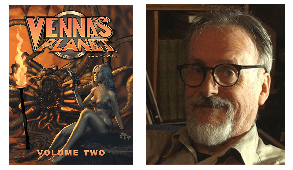
Again, I’ve worked on the visual elements, and Volume Two begins with a sort of zoom-in from space, down to the surface of the planet, where the action begins. That’s something that would look pretty good on a cinema screen! And there is a very scary monster in this – well, quite a few of the same species that crop up now and again to menace Venna and her pals. All teeth and tentacles. I call it a Trunch, and I came up with this baby when I was doing the evening paper version back in ’91. It’s served me well, and features in the cover art of both versions of the second instalment – two quite different pieces of artwork. Nothing wrong with the original version at all. In fact, I’m hoping to bring that out as a poster soon.
For you, what do you think makes Venna such a compelling and resilient protagonist?
What makes Venna a compelling and resilient protagonist? Well, she’s been around since 1987, so she certainly has staying power. Like I said, when this was first commissioned, the brief was, ‘intergalactic blonde sex goddess, please’. She’s evolved beyond that. She’s a nice-looking woman by any standards, I think, but she can’t help that, and she doesn’t play on it. It’s more about how people react to her, and the story has come to be more about her wanting to make a choice in her life, and not being allowed to.
The thing with Venna is she’s almost certifiably kind and understanding, and no amount of training, fighting or ill-treatment has ever been able to crush her good nature. After she is very cruelly treated by another female character in Volume Two, she is told that she is ‘too soft’, when she pleads with her rescuers not to hurt her attacker. She muses to herself, ‘She’s right – I am soft – but strong enough to not be hardened by the likes of her’, which is one of the messages or morals of the story, if there is any such a thing.
Some instantly love Venna, some desire her or want to ‘possess her’ (such as The Countess) and at least one woman utterly loathes her. She just wants to be herself, be helpful to her friends and colleagues, and make good on the new planet. But she can’t see the bigger picture. And nor can we, yet, but all will be explained in the final volume.
Venna’s Planet is clearly influenced by the golden age of comics. Are there any specific creators or works that inspired your approach?
There are a lot of influences that could be seen in my work, but I think the main sources of inspiration are, as I said earlier, newspaper comic strips and cinema films. And, by that, I mean anything from Flash Gordon serials from the thirties (which I never say until the late seventies) to films I went to see in the 1960s, the most enjoyable for me being the James Bond movies of that era to anything that featured the work of the great Mr Ray Harryhausen, whose creations paved my childhood with gems of real wonder.
So, yes, we usually had a lot of random comics in the house, and I enjoyed those, both the DC and Marvel ones. I also had a very well-produced British comic called TV21, which ran most of the Gerry Anderson tie-in stories, but these were beautifully rendered for the most part and were sometimes better scripted than the TV shows. Frank Bellamy and Ron Embleton worked on some of those, and those guys were just fabulous artists – I fancy myself sometimes, but they were the real deal.
Volume Three is scheduled for publication as well. Can you give us any hints about what fans can expect from the conclusion of Venna’s story?
I’m hoping to have Volume Three of this trilogy wrapped up and out there by the end of 2025, and I’m making a lot of changes this time around. I’ve begun work on this already, and the first thing I’ve done is swap around the order of the opening sequences. As before, I’m extending individual scenes, but only when necessary, to make sense of the story, or to make the narrative run more smoothly. Not many people know that I’d done a lot of work on a proposed Book Four. Most of the black and white artwork will not be used now, but at least one sequence will be repurposed for Volume Three – and I can’t tell you what it is at this stage, because I want it to come as a surprise, but it will explain a lot of things that are happening in the story. Also, the ending is going to be quite different.
Revisiting this project has made me understand so many things that I didn’t see before, and I know how silly that must sound, considering that this all came from me in the first place. Stories must have some kind of logic, and after a time the narrative takes on a form and a pace of its own, and some of the characters start doing their own thing, and it’s almost impossible to get them to do what you want them to for plot purposes. We, as the mere scribes or artists, merely report what we are told, or what we ‘see’ or ‘hear’ in our addled imaginations. Sometimes that message is garbled, sometimes it’s simply false. For these special editions, I feel the message is coming through more clearly, and the rest of it I can figure out from other events that are taking place in the narrative. Yes, that sounds completely cuckoo and probably is, but it’s the best way I can describe it.
Finally, you’ve mentioned that cinema has had a big influence on you, if Venna’s Planet were adapted into a movie or series, who would you cast as Venna?
As I say, I think of what I do in cinematic terms. I hardly ever visit the cinema these days, and most science fiction actioners aren’t made for septuagenarians…so when I see a trailer with a bunch of Hollywood actors walking in slow motion towards the camera while wearing superhero outfits, I’m not persuaded that seeing that movie would bring me any pleasure or excitement. The point is, I’m very out of touch with modern movie stars, and I don’t know the names of many of them.
If this was the mid-sixties, I’d say Shirley Eaton, because she was in loads of films that cropped up on TV at one time, and became famous in Goldfinger, of course. Whenever I write Venna’s dialogue, I often have Shirley Eaton’s voice in my mind. If this was the late seventies, I might have said Sally Knyvette (although she might not have approved of the brevity of some of Venna’s outfits), who played the similarly sounding Jenna on BBC’s Blakes 7. There was something about she played that character that was intriguing and likeable.
I think Margot Robbie has done some good work, and she looks fabulous. She seems to have the right mixture of humour, intelligence, talent and physicality. She’d get my vote. Put simply, Venna is really a smart, ordinary young woman from our recent past – 1970. She isn’t a superhero. Anyone who could play such a character and bring out what is interesting about her, and make the audience understand what is beautiful about her would be the one – and I suppose that’s why I think Margot Robbie could do it. If you can play Barbie and play Sharon Tate for Tarantino, you must have something! My Venna speaks with a very bright, charm school English accent. I know Ms Robbie is from Australia, which is why I think she could carry it off perfectly.